Heatmaps
Heat maps show how the markets are behaving in a single glance. Every instrument is a tile: its size represents its weight (capitalisation) and its colour its performance — green when up, red when down, with more intense shades for larger moves. The platform offers two maps: one for stocks and one for ETFs.
Where they are
Section titled “Where they are”Side menu, Heatmap → Stock Heatmap and ETF Heatmap. Both are available on all plans, including Free.
Stock Heatmap
Section titled “Stock Heatmap”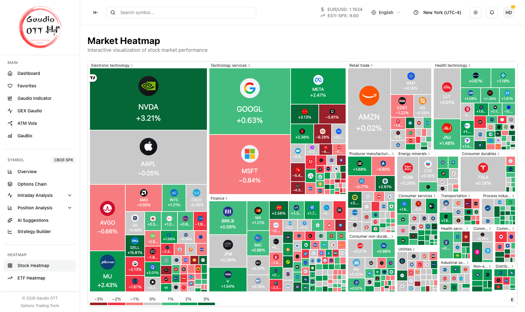
The Stock Heatmap: tile size is capitalisation, colour is performance, and the blocks are sectors.
Stock Heatmap opens the market heat map: constituents are grouped by sector — technology, financials, consumer goods, energy and so on — so you immediately see which sectors are pulling the market and which are holding it back. The larger tiles are the higher-capitalisation companies.
ETF Heatmap
Section titled “ETF Heatmap”ETF Heatmap applies the same logic to the ETF world. It is useful for a more portfolio-oriented view, by geography and asset class, rather than a single-stock view.
How to read it
Section titled “How to read it”- Colour — green and red for direction, intensity for the size of the move. The reference scale is at the bottom of the map.
- Size — the larger the tile, the greater the weight of that instrument.
- Grouping — the sector blocks help you distinguish a broad rally from one concentrated in a few sectors.
The map is interactive: hovering over a tile shows the details of the individual instrument. It is the ideal tool for a fast read of market state at the start or end of the day.
Both maps follow the interface language and the light or dark theme you have selected.
Why traders use it
Section titled “Why traders use it”Breadth. An index can be up half a percent because everything rose a little, or because two mega-caps rose a lot while the rest fell — and those two situations call for very different positioning. The heat map is the fastest way to tell them apart, and it does so before you open any single chart.
Common mistakes
Section titled “Common mistakes”- Reading a big green tile as a strong move. Size is capitalisation, not performance; the shade is the performance.
- Comparing tile colours across the two maps. Stock and ETF maps have their own scales and constituent sets.
- Using it as a screener. It is a visual read of state; use the Opportunities Scanner when you need ranked, filterable results.
Frequently asked questions
What do the Gaudio OTT heat maps show?
Market performance as a grid of tiles: the size of each tile represents the instrument capitalisation and its colour represents performance, green when up and red when down, with more intense shades for larger moves. There is one map for stocks, grouped by sector, and one for ETFs.
How do I read a heat map?
Colour gives direction and intensity gives the size of the move, with the reference scale at the bottom. Tile size gives the weight of the instrument. The sector grouping distinguishes a broad rally from one concentrated in a few sectors. Hovering over a tile shows the details of that instrument.
What is the difference between the Stock Heatmap and the ETF Heatmap?
The Stock Heatmap shows individual companies grouped by sector, so it reads sector rotation. The ETF Heatmap applies the same logic to ETFs, which gives a more portfolio-oriented view by geography and asset class.
Which plans include the heat maps?
All of them, including Free. Both the Stock Heatmap and the ETF Heatmap are part of the Heatmap feature group available on every plan.
Why does a large tile not mean a large move?
Because tile size encodes capitalisation, not performance. A large tile is a heavyweight instrument; how much it moved is shown by the intensity of its colour.
Related pages
Section titled “Related pages”Ready to use Gaudio OTT?
Section titled “Ready to use Gaudio OTT?”Open your free account and put what you just read into practice.