

Market Movers
Market Movers answers one question: what is moving in the US market right now. Six rankings, a strip with the names worth a look, a sortable table of the thousand most traded stocks and ETFs, and — outside cash hours — a panel with what is trading in the pre-market or after hours. Every ticker on the page opens the symbol in one click.
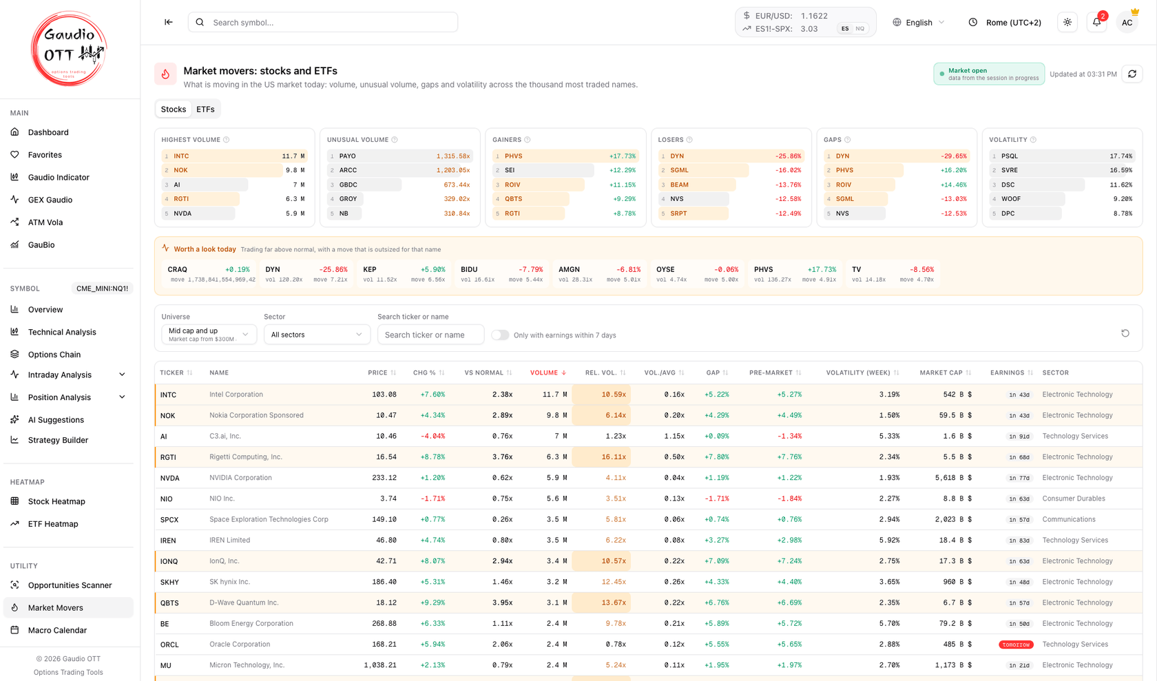
The Stocks tab: rankings at the top, the amber “Worth a look today” strip in the middle, and the table sorted by volume. The amber rows are the same names shown in the strip.
Where it is
Section titled “Where it is”Side menu, Utility → Market Movers. Available on the Premium and Ultra plans, and like the rest of the dashboard it needs a verified email. It is not tied to the active symbol: it scans the whole US market.
What it covers
Section titled “What it covers”Every session the page ranks the thousand most traded names on NASDAQ, NYSE and AMEX. The floor is trading activity, so the universe is made of names where something is actually happening today — not a fixed watchlist.
Stocks and ETFs are kept on two separate tabs, each with its own rankings, its own table and its own filters, because the two are not measured with the same columns. Switching tab resets the sector filter and the sort order — a sector and an asset class are not the same list.
What both tabs have
Section titled “What both tabs have”The rankings
Section titled “The rankings”Each card shows the top five names, with a bar scaled to the leader of that card, so you can see at a glance whether the first name is running away from the rest or they are all bunched together. The question-mark icon on each card repeats what it measures.
| Card | What it ranks |
|---|---|
| Highest volume | The names with the most shares traded this session |
| Unusual volume | Volume against what is normal for this time of day: above 1 means more trading than usual |
| Gainers | The largest gains against the previous close |
| Losers | The largest losses against the previous close |
| Gaps | Which names opened furthest from the previous close, in either direction |
| Volatility | Average size of the swings over the last week — Stocks tab only |
“Worth a look today”
Section titled ““Worth a look today””The amber strip under the rankings is the shortest list on the page: the names that combine trading far above normal with a move that is outsized for that particular name. That combination is the signature of a reaction to news, and it is what the whole page is built to surface.
Under each ticker the strip shows the two numbers that put it there — vol is how many times its normal pace it is trading at, move is how many normal days of movement happened in this one.
Two things to know about the strip:
- If there is nothing to flag, the strip does not appear at all. On a quiet market “no anomaly” is the correct answer, and a strip that is always there teaches you to ignore it.
- It does not reorder the table. The same names carry an amber edge in the table below, so you can find them there without losing your own sort order.
What the amber means
Section titled “What the amber means”Amber flags an anomaly, never a direction: green and red keep their usual meaning of up and down. A name gets the amber edge when trading far above normal meets a move that is outsized for its own habits, and the Rel. vol. cell is filled in amber when the volume is the signal that fired.
The filters
Section titled “The filters”The filter bar sits between the rankings and the table.
- Universe — the quality floor of the whole page. Four presets: Everything (no floor), Small cap and up (market cap from $50M, price from $1), Mid cap and up (from $300M and $2, the default) and Large cap (from $2B and $5). On the ETFs tab the floor applies to AUM.
- Sector / Asset class — one sector on Stocks, one asset class on ETFs. The list only offers what is actually present in the current universe.
- Search ticker or name — matches both the ticker and the company or fund name.
- Only with earnings within 7 days — Stocks only, for when you are looking for the event and not the move.
- Reset — the circular arrow on the right clears everything back to the default. The label next to it counts how many filters are active.
The universe preset applies before the rankings, not just to the table: with no floor the “Unusual volume” card fills up with micro caps trading at a few cents, where a four-digit multiplier means nothing. Your choice of preset is remembered on that browser.
The table
Section titled “The table”Sorted by volume, highest first, and every column with the double arrow can become the sort key. It shows 50 rows at a time, with Show more at the bottom and a counter of how many of the filtered names you are looking at. The ticker is a link: it opens that symbol’s Overview and makes it the active symbol for the rest of the platform. Narrow screens drop the least essential columns first; on a wide screen the table shows them all.
The two volume columns are not the same thing. Rel. vol. is adjusted for the time of day: it compares the volume so far with the volume at the same point of previous sessions, so it is meaningful ten minutes after the open. Vol./avg is the plain ratio against the 10-day average, which early in the session always understates — at 10:00 a name that is on pace for a record day still shows a fraction of its average. Read Rel. vol. during the session and use Vol./avg as a confirmation towards the close.
The Stocks tab
Section titled “The Stocks tab”| Column | What it says |
|---|---|
| Ticker / Name | The company. The ticker opens the symbol |
| Price | Last price of the session |
| Chg % | Change against the previous close |
| Vs normal | Today’s move divided by how much that name usually moves: 4x means four normal days packed into one |
| Volume | Shares traded this session |
| Rel. vol. | Volume against normal for this time of day |
| Vol./avg | The raw ratio against the 10-day average volume |
| Gap | Distance between the open and the previous close |
| Pre-market | Change in the pre-market session against the official close |
| Volatility (week) | How wide the swings have been over the last week |
| Market cap | Market capitalisation |
| Earnings | Days to the next earnings release, highlighted from a week out and shown as today or tomorrow when it is imminent |
| Sector | Sector of the company |
Vs normal is the column that makes the table comparable. A fixed percentage selects by size, not by anomaly: a -17% day can be an event for a mega cap and an ordinary session for a small cap. Dividing the move by how much that name usually swings turns it into “how many normal days of movement happened today”, which reads the same on any name.
Volatility (week) is a habit, not today’s move. It says how much the name usually swings, which is what makes the number next to it meaningful.
Where the volume is
Section titled “Where the volume is”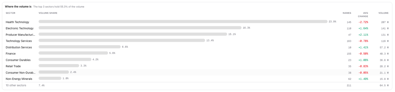
Volume share by sector, scaled to the leading sector, with how many names make it up and the average change.
At the foot of the Stocks tab, the sector breakdown answers a different question from the rankings: not which name is moving, but where the activity is. The bar is the sector’s share of the day’s volume, the headline says how much the top three sectors hold between them, and Names tells you how many stocks are producing that volume — a large share carried by ten names is a very different market from the same share spread over a hundred.
Avg change is weighted by market capitalisation and computed on the ranked names, not on the whole sector. The last row groups the remaining sectors so the total still adds up. For sector performance across several periods there is the dedicated card in the Dashboard.
The ETFs tab
Section titled “The ETFs tab”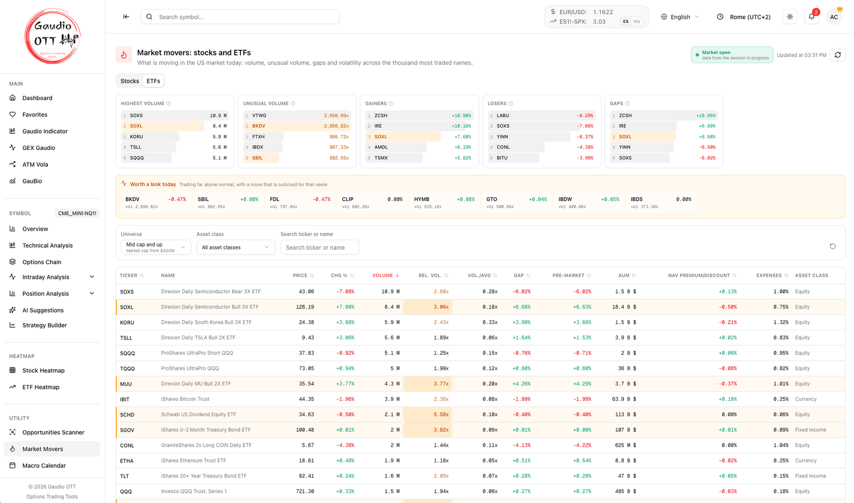
The ETFs tab: same layout, different columns — AUM, NAV premium/discount, expenses and asset class.
| Column | What it says |
|---|---|
| Ticker / Name | The fund. The ticker opens the symbol |
| Price | Last price of the session |
| Chg % | Change against the previous close |
| Volume | Shares traded this session |
| Rel. vol. | Volume against normal for this time of day |
| Vol./avg | The raw ratio against the 10-day average volume |
| Gap | Distance between the open and the previous close |
| Pre-market | Change in the pre-market session against the official close |
| AUM | Assets under management — this is what the universe floor applies to |
| NAV premium/discount | How far the price is trading from net asset value |
| Expenses | Annual expense ratio |
| Asset class | Equity, Fixed income, Currency, Commodity and so on |
There is no Vs normal column and no volatility ranking here: those need a volatility measure, which does not exist for ETFs. Two things follow, and they are worth knowing before you read the tab:
- Unusual volume says something weaker on an ETF. A fund is a wrapper, so volume far above normal is usually a flow of creations and redemptions rather than a reaction to news — you will often see a large multiplier next to a price that has barely moved. The amber highlight is therefore reserved for the larger funds, where the signal is not just an illiquid product being created once.
- The volume ranking is dominated by leveraged single-stock products. That is how out-of-hours and intraday ETF trading actually works, not a defect. Use the Asset class filter to get to the exposure you are actually looking for.
NAV premium/discount is the ETF-specific sanity check: a fund trading well away from its net asset value is telling you something about liquidity or about the underlying market being closed.
Pre-market and after hours
Section titled “Pre-market and after hours”The badge at the top right always declares which session the data belongs to: Market open with a green dot and “data from the session in progress”, or Pre-market, After hours, Market closed, Exchanges closed naming the session the numbers come from.
This matters more than it looks. Outside cash hours the table and the rankings stay those of the last completed session and update at the open — they are not stale by accident, they are the last real session, and the badge says so. The “Worth a look” strip changes its own title to name that session for the same reason.
What is moving right now is in the panel at the top, which appears only during the pre-market and after hours:
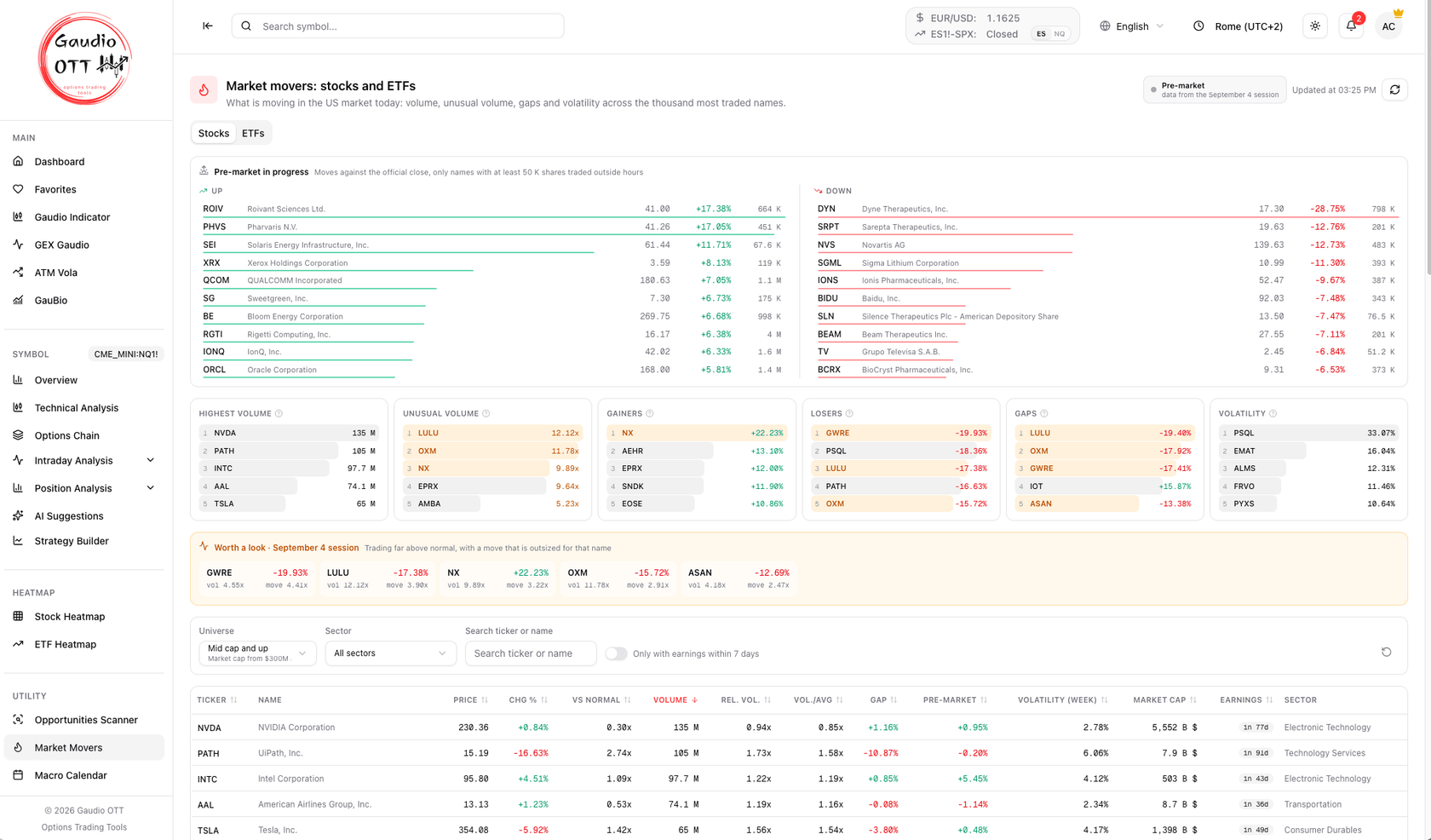
Pre-market on the Stocks tab: names up on the left, down on the right, and below them the rankings and the table of the last completed session, as the badge declares.
- Up and Down side by side, ten names each, measured against the official close.
- Only names with at least 50,000 shares traded outside hours: below that a single print moves the percentage by several points and the ranking becomes noise.
- Each side is ranked by out-of-hours volume, so both directions are covered, and each row shows the extended-session price, the change and the shares traded.
- Each tab shows its own: stocks on Stocks, ETFs on ETFs.
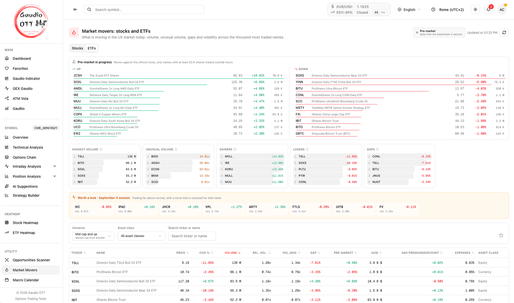
The same panel on the ETFs tab. Out-of-hours ETF moves say where the macro is heading before the open, and a leveraged pair usually confirms itself in opposite directions.
Refresh
Section titled “Refresh”The page refreshes on its own roughly every minute and a half, and the time of the last update is next to the badge. The circular-arrow button forces a refresh straight away. There is nothing to save and nothing to configure: your universe preset is the only preference the page keeps.
Why traders use it
Section titled “Why traders use it”Options analysis starts with a name, and picking that name by hand is the part nobody does well: you end up looking at the same six tickers every day. This page picks it from the market instead — the names where volume, gaps and volatility say something is happening today. The amber strip narrows the thousand down to a handful, the sector block says whether the day is broad or concentrated, and the pre-market panel gives you all of that before the open.
How to use it inside Gaudio OTT
Section titled “How to use it inside Gaudio OTT”Open Market Movers before the bell: the pre-market panel and the badge tell you what has already happened overnight. At the open, read the “Worth a look” strip first, then the Gaps and Unusual volume cards, and check the sector block to see whether the move is broad or concentrated in one sector.
When a name deserves a closer look, click its ticker: you land on the Overview, with Technical Analysis for the price levels and the Options Chain and intraday analyses for where the options are. If you are looking for a structure to sell premium on instead, the Opportunities Scanner starts from your constraints rather than from today’s move.
Common mistakes
Section titled “Common mistakes”- Reading an amber row as a buy or a sell. Amber says “unusual”, not “up”: the direction is in the green or red of the price columns.
- Comparing Chg % across names of different size. That is exactly what the Vs normal column is for: -8% on a quiet mega cap and -8% on a name that swings 20% a week are not the same event.
- Trusting Vol./avg early in the session. It always understates before the close. Use Rel. vol., which is adjusted for the time of day.
- Reading out-of-hours data as the session. Outside cash hours the table is the last completed session, as the badge states; live moves are only in the top panel.
- Chasing the ETF volume ranking. It is dominated by leveraged single-stock products: use the asset class filter, and remember that unusual volume on a wrapper is creation flow, not news.
- Leaving the universe on “Everything”. Without a floor the rankings fill with micro caps where a huge relative volume means nothing.
Frequently asked questions
What does the Market Movers page show in Gaudio OTT?
What is moving in the US market today across the thousand most traded names on NASDAQ, NYSE and AMEX, with stocks and ETFs on separate tabs. It shows rankings by volume, unusual volume, gainers, losers, gaps and weekly volatility, a strip with the names that combine unusual volume with an outsized move, a sortable table with price, change, relative volume, gap, pre-market change, market cap or AUM, earnings date and sector, a sector breakdown of the day volume, and a pre-market or after-hours panel when the cash market is closed.
Which plans include Market Movers?
Premium and Ultra. It is not available on the Free or Strategy plans. Like the rest of the dashboard it also requires a verified email address.
What does the amber highlight mean on Market Movers?
That the name is trading far above its normal pace and its move is outsized compared with how much that name usually moves — the signature of a reaction to news. Amber flags the anomaly only: the direction of the price stays green for up and red for down. The same names appear in the "Worth a look today" strip above the table.
What is the difference between Rel. vol. and Vol./avg?
Rel. vol. is adjusted for the time of day: it compares the volume traded so far with the volume at the same point of previous sessions, so it is meaningful right after the open. Vol./avg is the plain ratio against the 10-day average volume, which always understates early in the session and becomes reliable towards the close.
What does the Vs normal column mean?
It compares today's move with how much that name usually moves: 4x means four normal days of movement packed into one. It exists because a large cap and a small cap are not on the same scale — a -17% day can be an event for one and an ordinary session for the other, and a fixed percentage threshold would just select by size. It is on the Stocks tab only, since ETFs have no volatility measure to normalise against.
How is the ETFs tab different from the Stocks tab?
It replaces the stock-only columns with AUM, NAV premium or discount, the expense ratio and the asset class, and it has neither the Vs normal column nor the volatility ranking, because there is no volatility measure for ETFs. Unusual volume also means something weaker on a fund: it is usually a flow of creations and redemptions rather than a reaction to news, and the ranking is dominated by leveraged single-stock products, so the asset class filter is the way to get to the exposure you want.
Why does the table not update outside market hours?
Because outside cash hours the table and the rankings are the last completed session, and they update at the open. The badge at the top right always declares which session the data belongs to. What is moving right now is in the pre-market or after-hours panel at the top of the page, which compares out-of-hours prices with the official close and only appears during those sessions.
How often does Market Movers refresh?
On its own about every minute and a half, with the time of the last update shown next to the session badge. The circular-arrow button forces an immediate refresh.
Can I open a symbol directly from Market Movers?
Yes. Every ticker on the page — in the ranking cards, in the strip, in the table and in the pre-market panel — is a link to that symbol's Overview, and selecting it makes it the active symbol for the rest of the platform.
What is the Universe filter for?
It sets a minimum market cap (or AUM for ETFs) and a minimum price for the whole page: Everything, Small cap and up ($50M and $1), Mid cap and up ($300M and $2, the default) and Large cap ($2B and $5). It applies before the rankings, because without a floor the unusual-volume ranking fills with micro caps trading at a few cents, where a huge multiplier means nothing. The choice is remembered on your browser.
Related pages
Section titled “Related pages”- Heatmaps
- Sector performance
- Financial news
- Symbol overview
- Technical Analysis
- Opportunities Scanner
- Is the data real time?
Ready to use Gaudio OTT?
Section titled “Ready to use Gaudio OTT?”Create your free account and put what you have just read into practice.